

Landing Page Development: Structure, Speed and Conversion Guide
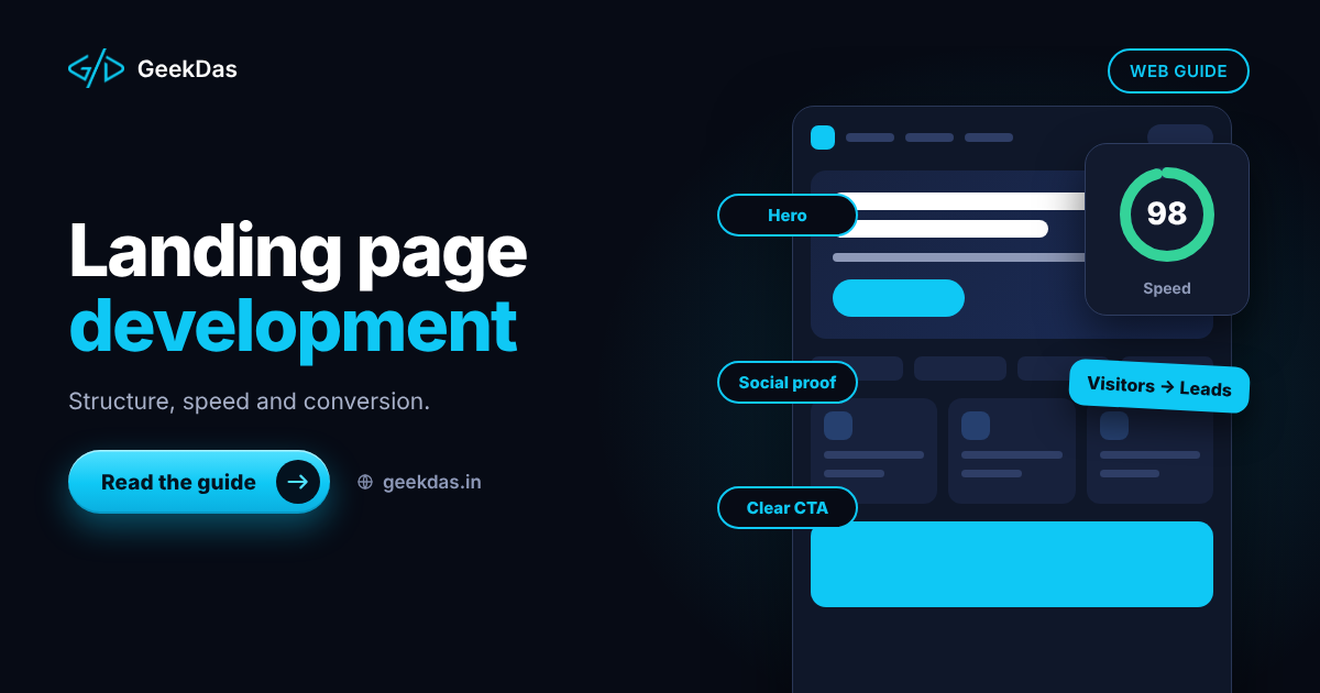
A landing page has one job. Every extra second of loading time, every unclear sentence and every competing link costs you leads, and if you are paying for traffic, it costs you money directly. The good news is that the principles of a page that converts are straightforward and mostly about restraint.
This guide covers what a landing page is and how it differs from a homepage, the structure that tends to work, how speed, forms and tracking affect results, how to build and test one, and the mistakes that waste ad spend. It is for marketers and business owners, with enough technical detail to brief a developer well.
What is a landing page?
A landing page is a standalone page built for a single purpose: getting a visitor to take one action, such as filling in a form, booking a call, signing up or buying. Visitors usually arrive from an ad, email, social post or search result.
Landing page vs homepage
Landing page | Homepage | |
|---|---|---|
Goal | One specific action | Orient visitors and route them |
Navigation | Minimal or none | Full menu |
Audience | Visitors from one campaign | Everyone |
Content | Focused on one offer | Broad overview |
Measurement | Conversion rate for one action | Many goals |
If you are building a full company site instead, see custom website development vs website builders.
Anatomy of a landing page that works
The order below is a reliable pattern. Adapt it; do not treat it as a rigid template.
1. A headline that matches the promise
The visitor clicked an ad or link with an expectation. The headline should confirm it in plain words. This is called message match, and a mismatch is a common reason for high bounce rates.
2. A short supporting statement
One or two sentences saying who it is for and what changes for them.
3. A clear primary call to action
One main action, worded as what the visitor gets ("Get a quote", "Book a 20-minute call"). Repeat it after major sections so it is always reachable.
4. Proof
Evidence that reduces doubt: real client names with permission, genuine testimonials, logos you are entitled to use, specific outcomes you can substantiate, certifications. Do not invent or exaggerate; false proof harms trust and may breach advertising rules.
5. How it works or what you get
Three to five steps or benefits. Explain the outcome, not only the features.
6. Handling objections
Short FAQ or notes addressing price, timeline, risk, and what happens next.
7. A form or action area that is easy to complete
Ask only for what you need. Each extra field typically reduces completions. Explain what happens after submission.
8. A closing call to action
A final prompt at the bottom for visitors who read to the end.
Speed matters more than design polish
Slow pages lose visitors before they see the offer. Aim for fast loading on mid-range phones over ordinary mobile connections.
Optimise images: correct dimensions, modern formats (WebP or AVIF) and lazy loading below the fold.
Limit third-party scripts: chat widgets, multiple tracking tags and heavy fonts add delay.
Serve fonts efficiently: fewer weights,
font-display: swap.Avoid layout shifts: set image dimensions so content does not jump.
Use a lightweight build: custom code ships far less than a page builder with many widgets.
Measure: use Lighthouse and the Core Web Vitals report for real-user data, aiming to pass the Largest Contentful Paint, Interaction to Next Paint and Cumulative Layout Shift thresholds.
For a deeper treatment, see the website redesign and Core Web Vitals guide.
Mobile first
Most campaign traffic arrives on phones. Design for the phone first:
Large, tappable buttons
Short paragraphs and readable text size
Forms that use the right keyboard type (email, number, telephone)
Click-to-call and WhatsApp options where your customers use them
A call to action visible without much scrolling
Test on a real device, not just a desktop browser window.
Forms and lead handling
Validate input sensibly and show clear error messages.
Protect against spam without forcing visitors through frustrating puzzles.
Deliver leads instantly to email or CRM, and send an automatic confirmation.
Respond quickly; response time often matters more than page design.
Store personal data responsibly and state how it will be used, in line with the privacy laws that apply to your audience.
Tracking and measurement
Decide what counts as a conversion before launch, then measure it.
A conversion event for form submissions, calls or clicks
Source tracking via UTM parameters (the free UTM link builder helps keep them consistent)
Ad platform pixels set up with consent where required
A baseline conversion rate to compare against future versions
Test changes one at a time and with enough traffic to be meaningful. Small samples produce misleading results.
SEO for landing pages
Paid landing pages are often not meant to rank, and sometimes should be excluded from search to avoid duplicate content. If a page is intended to rank, include:
A unique, descriptive title and meta description
A single H1 and logical headings
Fast loading and mobile usability
Structured data where relevant
Descriptive image alt text
Decide deliberately whether each page should be indexed.
Build options
Option | Pros | Cons |
|---|---|---|
Page builder or landing page platform | Quick, editable by marketers | Heavier pages, monthly fees, limited control |
WordPress page builder | Familiar, flexible | Plugin weight and maintenance |
Custom coded page | Fast, light, fully tailored, easy to measure | Needs a developer for changes unless set up for easy editing |
A custom page makes sense when speed, tracking accuracy or brand control matters, or when you will run many variations on a clean base. A platform is better if marketers need to publish new pages daily without a developer. Custom landing pages are covered under landing page development on GeekDas, where a focused page typically takes 3 to 7 days once copy and branding are ready.
Pre-launch checklist
The headline matches the ad or link
There is one primary action
The page loads quickly on mobile
The form works, and leads reach the right place
Confirmation message or page appears after submission
Conversion tracking fires once per submission
Links, phone numbers and WhatsApp buttons work
Privacy and cookie notices are in place where needed
Proof elements are genuine and approved
The page looks right on common phones and browsers
Indexing is set intentionally
Common mistakes
Too many choices. Multiple offers and menus compete for attention.
Feature lists without outcomes.
Generic headlines that could be on any company's page.
Long forms for a low-commitment offer.
Heavy sliders, videos and scripts that slow loading.
No tracking, so you cannot tell what works.
Sending all traffic to the homepage.
Fake urgency or testimonials.
Never testing on a phone.
Who benefits from a dedicated landing page
Businesses running paid ads
Product launches and event sign-ups with fixed dates
Consultants and agencies capturing leads for a service
E-commerce campaigns promoting a product line, which can complement the e-commerce website development guide
For general pricing logic on small sites, see what a business website costs in India, which includes a landing page category.
Why GeekDas
GeekDas builds landing pages as custom code rather than in page builders, with mobile-first layouts, validated lead forms, analytics and ad pixel setup, and on-page SEO. As a one-developer practice based in Jaipur, Rajasthan, it suits businesses that want quick turnarounds and direct communication. Copy and customer insight should come from you; I can structure the page and suggest copy direction.
Conclusion
A landing page converts when it is focused: one audience, one promise, one action, delivered quickly on a phone and measured properly. Resist adding options, prove claims honestly and test changes one at a time.
If you need a landing page for a campaign or launch, share the offer and the timeline and I will propose a structure and a delivery date.
Was this article helpful?
Comments
Leave a comment
Loading comments...